1. Subject Line Contains the Word "Free"
The email subject was the the following: "Free $10 Shoppers Drug Mart Coupon!".
Typically email recipients will block anything with the word "free". This is an email no no. Magically the email arrived in my inbox - I may have whitelisted the "from address".
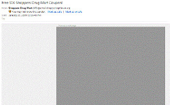
2. The Email Looks Like This:

Do I need to say more? Ok, I will.
If the "from line" and "subject line" did not say "Shoppers", I would have deleted the email right away. However, I did open it and I see this black box. What is this?? Emails today should not be all images for this reason. Email clients like Hotmail or Outlook (B2B and B2C recipients) will automatically block images. It's a necessity that the email contains text that is visible when the email is opened. An unsuspecting recipient may have thought this was a scam and quickly clicked on the "this is spam" link.
Including images in an email is actually a good idea depending on the email and the target audience. Besides blending in text, adding in ALT tags to the images could have outlined what the images were about. For example, the ALT text could have been "Shoppers is offering a $10 off coupon for this weekend". This unfortunately was not done and I have a grey box staring back at me. It gets worse - much worse.
3. Do I Look Like a Woman? Seriously.
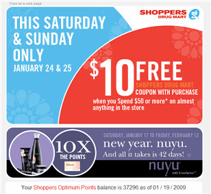
Here is the email once I enabled the images:
 If you notice, the products being advertised are women's beauty products. Thanks Shoppers, just what I wanted and it only takes 42 days for a "nuyu"- great (heavy sarcasm here)! In 2009, you need to ensure that emails are highly personalized. That means that every part of the email should have relevant information that I'm interested in. I'm part of the Shoppers Optimum Points program - I'm sure I provided my gender when I'm signed up. The products that I should see could be something like shaving gel. Let me be specific MEN'S shaving gel. In fact they should know my previous purchases and use that data to promote relevant products.
Ok, that may be pushing things but they could have used my age for improved segmentation.
If for some reason you may not have all of the relevant data for improved segmentation, look for ways to collect that information over time. I would have gladly updated my profile to get the coupon or to have downloaded some relevant information (if we're looking for a B2B example).
We are bombarded by too many emails and messages today. The emails need to be sent at the right time and with the right message.
Now, you may have noticed that Shoppers did include my Shoppers Optimum points balance - which is a personalized piece of information. A few notes here on how a good thing went wrong:
- It's too bad that I never saw this until I scrolled down. This information should have been near the top.
- I have 30 million points - so what? What can I do with those points? If you're going to include my points balance, make it actionable - if it doesn't add anything, don't include it. This information wastes space and takes away from the main purpose of the email.
4. How do I get the Coupon?
So I get over the fact that I first see a grey black box and that they think I need a makeover with women's facial cream. Yes, I'm insulted but I would like the coupon because I've run out of Shampoo and I have a Shoppers across the street from me (they're everywhere in Canada). I click on the image of the coupon. I click on it again. NOTHING HAPPENS. I click on the image of the women's' beauty products - that link works! The last tip I can give Shoppers is that you need to test your email campaigns and ensure that all images are clickable. While you can't tell from the grey image above, it's actually two images and they just forgot to add the correct link.
I hope that you and Shoppers have learned something from this campaign. Companies will waste precious marketing dollars if simple email best practices are not followed.
Chad H.
PS - If you live up here in the North, you can go here for the coupon
PPS - Here are some additional email tips:
- Email Tips for the New Year Part I
- Email Marketing 101: Tips and Best Practices
- 10 Tips for Using Twitter And Email Marketing for B2B
8 comments:
I think your being a little hard here... it's not perfect but it's not as bad as your claiming.
1 - Free is not as Taboo as your making it out to be. It works well in many cases to drive response and is only a small part of the rules for delivering email. Subject starts with "Free" is only a 0.286 in SpamAssassin - hardly a large bump.
2 - I agree bad use of image best practices.
3 - The majority of people that shop at SDM are women (like 4 to 1) so targeting women in the "Ad" portion of there messages make sense, but it's a bit lazy. I agree thought that adds could be better targeted to the recipients (i.e the spend $50 on cosmetics and get 20X the points type). The important piece to note is the "Almost anything in store" portion that covers everyone.
4 - This is an ad for - spend 50$ we will give you the 10$ after. The call to action happens after the sale there is no coupon up front to download or print. Even the "coupon" you link to is not a coupon - it's another ad for the spend $50 and we will give you $10.
Matt
@emailkarma
Matt - I appreciate your comments. I stand corrected about #1. In regards to #3, I never saw the text "Almost Anything in the store". I was too turned off by the image of beauty cream. You know what they say about first impressions. In regards to #4, I guess I misunderstood that. Is it my bad? Perhaps. I believe it wasn't all that clear. In any case, what a waste not to have an image of that size to be clickable. Wouldn't it make sense to drive people to the Shoppers website to checkout what they could get? This is not even best practices - it's just common sense. Thanks again for dropping by!
Great tips Chad! Personalizing emails does take a bit more time to create but results in better response rates. Like you said, women's beauty products for guys? The only way I'd see this work is if they didn't ask for your gender and only know your past purchase history. Because many families share just 1 store card, they may not be able to tell the gender of enough of the people on their list to target by gender, so if they send a generic offer ($10 discount) with a little promo offer for women, maybe they think readers could pass it along to the ladies in the household. Either way, it's interesting to read your perspective. In comparison, here's Costco's example of a good email campaign: http://blog.mailermailer.com/2008/09/costco-email-marketing/.
Chad, great topic. Thanks for posting the analysis of the email. I agree, I think it's almost comical that people still send image only creatives. The funny thing is that I still see marketing professionals develop these all the time.
Whenever I've been asked to deliver them, I refuse because it's a total waste. Instead I recommend a combo use of content with supporting images. I've brought this issue up countless times, but they still use resources to develop image only creatives and try to deliver them.
I also try to avoid "Free" becaue I think it's played out and people ignore it. I've had good success using "complimentary" or other variations that sound more value based.
Carson
Maggie - thanks for your comment and the link. That's a great Costco newsletter. Great point on the family concept. I would be interested if Shoppers took this into consideration. I doubt it. :)
Thanks for your comment Carson. I liked your perspective on the word "free".
Hmmm.. interesting post for sure!
I am just stepping into the world of email campains but even I, a real newcomer wouldn't send just images.
While some of their mistakes may be overlooked for a small operation, I do believe Shopper's should be employing someone with the foresight to ask for age, gender etc. or at the very least make their campaigns appeal to everyone. AND make sure it's obvious where and how to get your savings!
@Louise - agreed! Thanks for stopping by.
Post a Comment