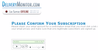
I came across a few interesting tips for your confirmation pages:
Using Audio and Chat on Your Confirmation Pages
 In what seems like ages ago, I wrote a post about blogging while being stuck at airport.
Use an audio confirmation clip on your confirmation page. Check out how this is done on Delivery Monitor after you sign up for their newsletter. It's brilliant as it sets expectations (i.e. when you can receive emails, what will be in them) and gives you a bit of the company's personality (which is boring by the way). This is a great idea and you can do a lot with this concept as the confirmation page is like a gateway into receiving additional information. The web visitor has given consent for you to send them emails and an audio message sets the tone for a great relationship. You might also notice that these guys have added a chat feature so you can ask them questions as well. These Delivery Monitor folk are some really bright people.
Tips for Your Unsubscribe Confirmation Pages
Stefan Pollard continues to write some brilliant posts on the unsubscribe process. He recommends making this a two step process. Have an unsubscribe link in the email and make the email recipient chose to unsubscribe from the landing page. On the confirmation page, he recommends adding the following:- Include a customer contact number
- Have a link to a contact form
- Include a feedback survey
- Add a manage your profile link. Perhaps they still want to receive your emails in some capacity. For example, have a way for them to unsubscribe temporarily
- Tell them how they can re-engage with you at a later point
- Let them know that they can subscribe to a blog feed via RSS.
Do you have any great ideas you've tried?
Chad H
No comments:
Post a Comment